Similar Projects
See All Work
"Out Since Tuesday is a creative house engrained within the arts, using production, design and strategic direction as a means of cultural expression."
As a full-service production house, Out Since Tuesday needed both a review of their branding strategy and a website that served as a showcase of their skills and services. Given the breadth of creative companies that specialise in production, they needed both a brand and platform that emphasised their mystique, setting an aesthetic edge that separated them from their competitors.
Having had an extended working relationship with Out Since Tuesday, I was already familiar with their brand and what they stood for at the time when I was approached for this project. Not wanting to be too destructive to the visuals they had at the time, I decided to work with the elements they had in place, building on their foundations to flesh out a more flexible logo mark.
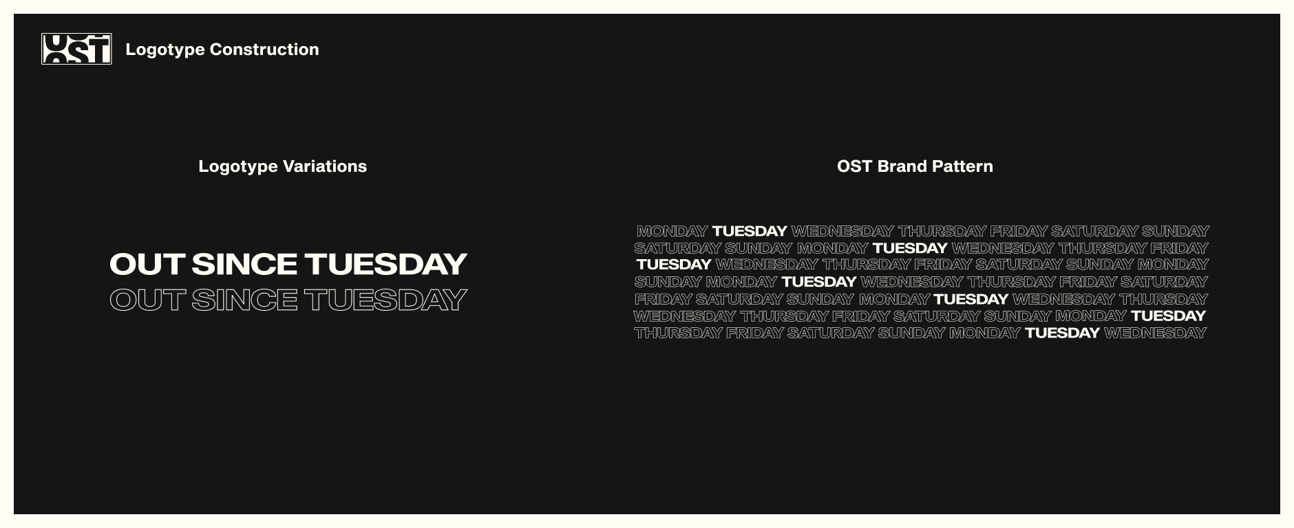
The flexibility of the new mark allowed seamless features across a multitude of media formats. This flexibility was achieved with the construction and deconstruction of the elements that make up the final design, including the type and style, allowing for a social mark, logotype and brand pattern to be extracted whilst retaining visual consistency.
The brand pattern would then go on to become one of the main features of the website's aesthetic, offering an interactive and navigational function. However, before I got into the look of the website, I had to focus on its core purpose - to showcase their works.
The website structure was relatively simple. Having worked with the design of Out Since Tuesday's previous websites, I understood that we had to be cautious with the size and amount of content that could slow the website's load time, so to counteract this, we came up with a 7 project concept.
The identity of Out Since Tuesday is one of a creative company that could be working on different projects on any given day of the week. With our 7-day concept idea in mind, we tied a day of the week to a particular project, to create an allure and to arouse user interest. I produced a simple site map to present this idea, detailing the structure of the website and the projects that could feature.

To add to both function and the aesthetic of the 7-day concept, I decided to experiment with the idea of the brand pattern sitting in the background of the website. Expanding on this, I chose to add hover triggers to highlight the users' interaction with the main menu. We then posed this idea to the client in the form of medium and, upon positive feedback, high fidelity wireframes.


The high fidelity wireframes were then used as a reference point to flesh out the final website for Out Since Tuesday. The full extent of the site can be seen below, presented in high fidelity mockups, as well as an optimised view of the website for mobile.
As for the branding, a full strategy deck was designed and handed over to set an aesthetic blueprint of the Out Since Tuesday Identity. Included in the deck was a variety of brand components, from the tone of voice to typographic styles and application concepts.
The success of the project was measured by the positive feedback the Out Since Tuesday website received, from their internal team, clients and creative network. As for the brand guidelines, they are currently in use and in the process of being developed further.


